The examples of the best web designs are constantly announced on sites like CSS Awards, Awwwards or Webby Awards.

The examples of the best web designs are constantly announced on sites like CSS Awards, Awwwards or Webby Awards.
CHALLENGE
We have become curious - how do these top-rated webpages look through the eyes of the user? What do people notice on these pages first? And what do the most successful designs have in common?
RESULTS
To find it out we have tested 18 award-wining web designs with AI-based design analytics Attention Insight. The heatmaps below reveal how powerfully each part of the design captivates the user’s attention. While numbers in red background show the percentage (%) of attention that a particular object received.
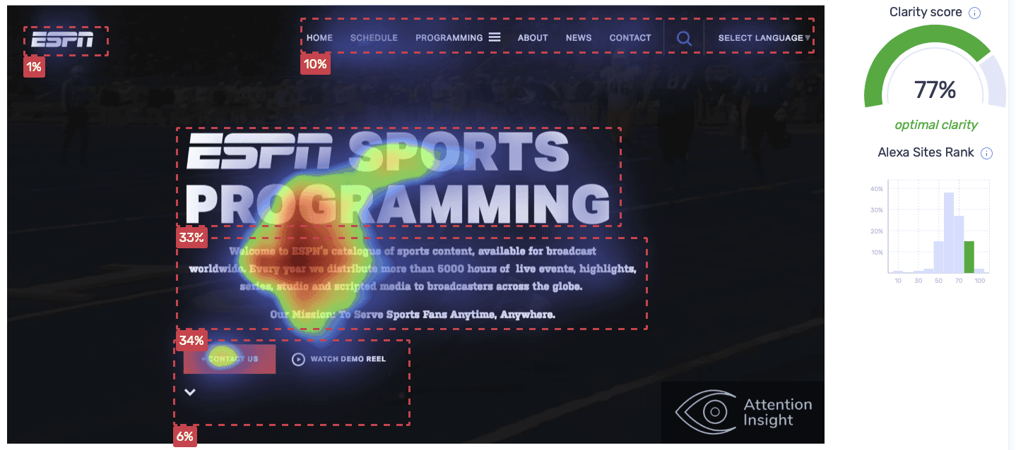
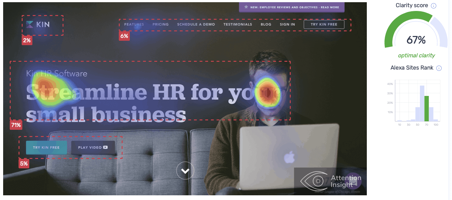
It is not only attractive but also informative site as the headline and company’s mission catch about 67% of the attention. CTA button “Contact us” is the second object visitors notice. All in all, it is well-designed users experience – visitors are directed to read about ESPN activity and then leaded to contact the company.
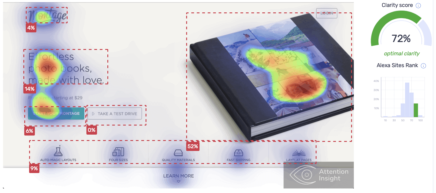
It is a great example of how to distribute attention among the most important elements. Visitors’ attention moves from product image to the main message then CTA button and finally – logo.
Zillow is a real estate company. The main goal of its page is to help users to buy sell or rent apartments. It is no wonder why the searching area receives the most attention – 53%.

It is a product-focused site. Based on the heatmap, visitors’ attention is concentrated on Revols headphones. The most attention is taken by a product image (35%) and the main message about product’s advantages (53%).

The first objects users notice are the main message and brand logo placed on the product. Then their attention moves to CTA buttons “Download” and “Buy at amazon”. However, quite a lot of attention is grabbed by a fingernail due to its bright color.
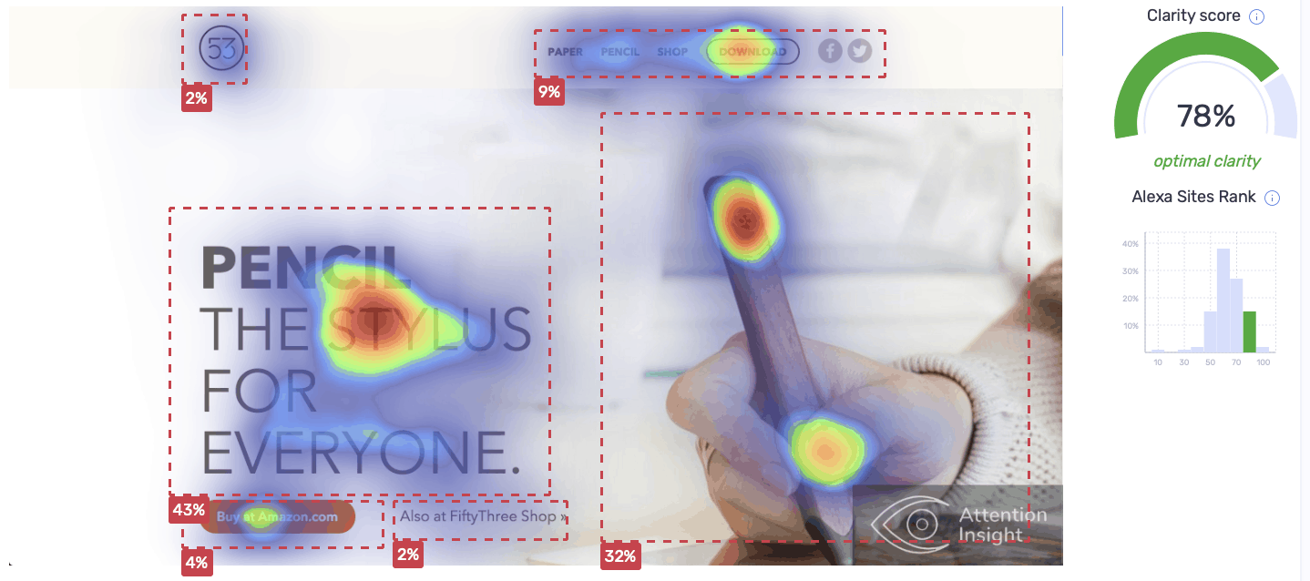
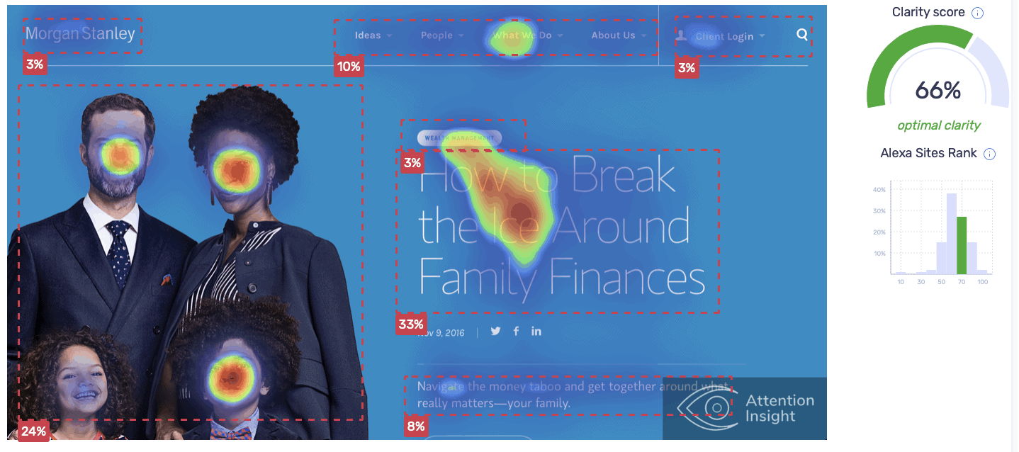
Image and title of the main article are the first things users notice and get most of the attention (57%). Section “What we do” is the second object that ctach visitors’ attention. The structure of the page provides visible information for existing and new visitors.
Visitors’ attention goes on the main message and CTA button “Reserve now”. However, looks like irrelevant part of the background image grabs most attention.

Wozber is a free resume builder. On its page, most attention is catched by the women face which is a part of product image – the resume. Then user attention goes to the main message, logo and CTA button “Create CV”.

Usually, as in this case, faces manage to grab most attention. Opus Grows logo at the corner of the page and on the product bag are second objects users notice.

Zero keeps the balance between minimal design and informative website. The main message and its description capture most of the attention. Then visitors’ attention is well-distributed among other elements such as logo, image related to the services, CTA button, menu bar.

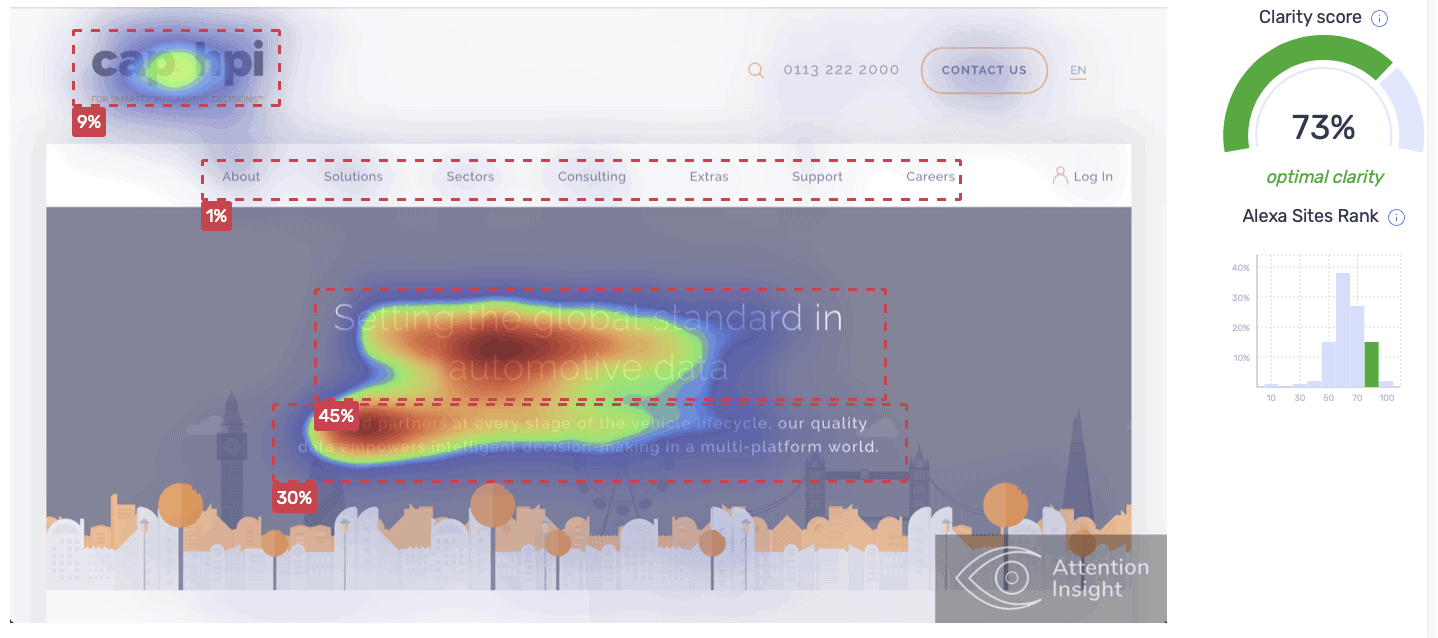
A heatmap-based user journey most likely reflects a clear goal of Cap HPI – to present who they are (logo) and what they do (the main message).
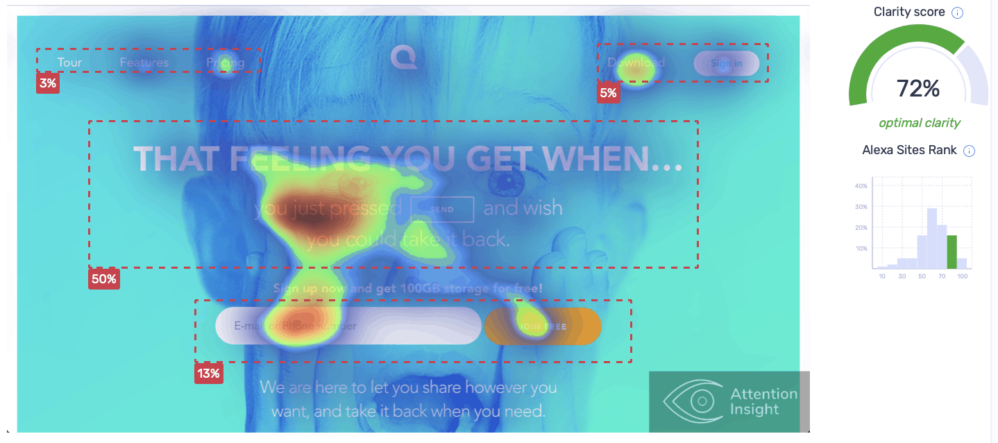
Visitors’ attention is distributed among the main message and CTA buttons “Join free”, “Download”, “Pricing”.
The slogan and CTA button are the most noticeable objects on the page. Interestingly, “Home” and “Features” on the menu bar receive a relatively large amount of attention.
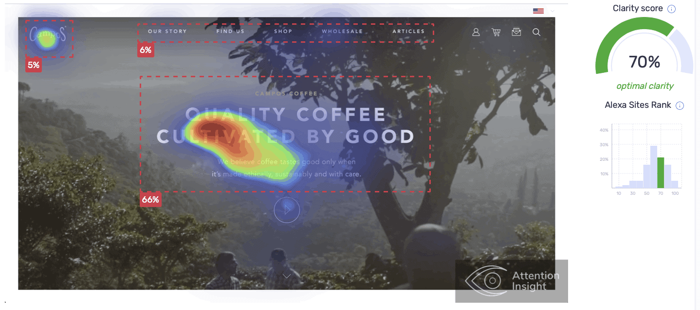
On Campos Coffee page, attention is mainly focused on the text which directs visitors to watch a video story about their product.
Whether it is strategic move or a coincidence, but due to a person at the background, the main message manages to capture even more attention.
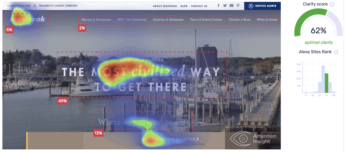
A design of Seastreak page directs visitors’ attention to the main objects - logo, the slogan and a ferry schedule.
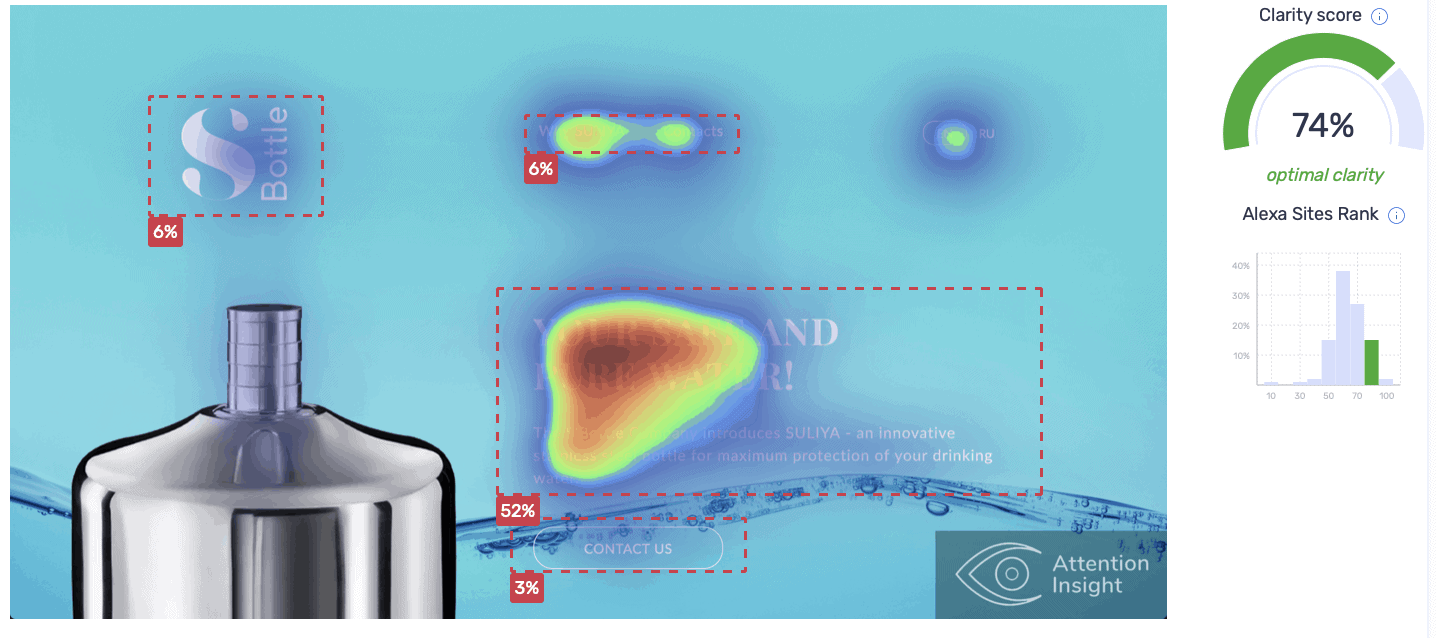
Appealing design of S Bottle page highlights the benefits of the product – “Your safe and pure water!”. “Why Syllya”, “Contacts” and a possibility to change language are second objects users notice.
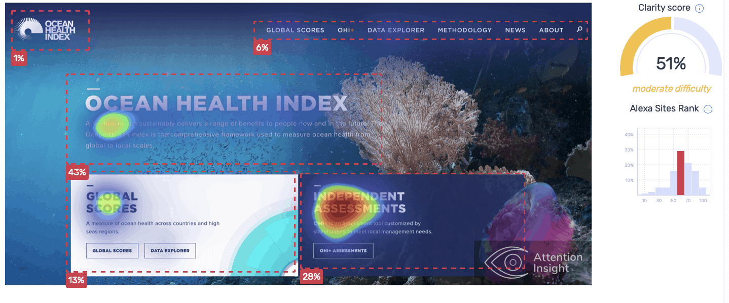
Even though the text box “Independent assessments” is in dark color and at first glance, it blends with the overall design, it is most noticeable object on the page. Besides, it receives more attention (28%) than a bright text box “Global scores” (13%). Meanwhile, the tittle “Ocean health index” is not the first thing visitors notice, but it captures a relatively large amount of attention – 43%.
TO SUM UP
Most of the websites have a clear, minimalistic, easy to navigate design. Clarity score of 15 from 18 websites ranges between 62-78% (100% indicates the maximum clear design). Based on the heatmaps, in most cases users' attention is well-distributed among the important elements. Finally, the smooth user journey reflects the goal of the brand.
© 2023 Attention Insight · Privacy Policy · Terms of Use