

According to marketing experts, most Americans are exposed to around 4,000-10,000 advertisements each day. But do they really capture consumer attention? And can something be done to improve the banner visibility?
Banner blindness is a common problem for online advertising. Because of the huge standardised banner flow users unconsciously ignore them on webpages. This phenomenon is also known as banner noise, ad blindness or ad fatigue.
A/B test to overcome banner blindness
As reported by Bannerflow, since 1995, CTR rates have dropped from over 2% to on average 0,05%. So analysing and testing is essential when learning what makes your audience click on banner ads.
A/B testing is one of the most often used strategies to overcome the ad blindness issue. It enables you to make a data-based decisions.
By adding heatmaps to your A/B test, you can predict how customers will be using your site. Heatmaps reveal which areas in your banners catch the attention and which ones stay unnoticeable. The downside is that some analytical tools require a lot of time to provide a heatmap. However, emerging artificial intelligence technologies are changing the rules of the game. AI-based solutions, such as Attention Insight, can generate a heatmap in seconds.
Attention Insight is an AI-based system trained with previous eye-tracking studies data that predicts users’ attention shifts with 90% accuracy.
A/B testing with heatmaps
So, how does it work? To illustrate that we have tested some popular news sites with an aim to analyse visibility of the banners. You could always create many banners with banner generator platforms.
Case #1
- Even though “KIIS” radio ad is more contrasting, it gets only 7% of the attention, while “Disney” announcements – 18% and 9%. Possibly, it is because of the size and placement.
- According to the heatmap, “Disney” banners not only catch visitors’ attention but also put focus on the main elements – logo and the area “Buy tickets”.

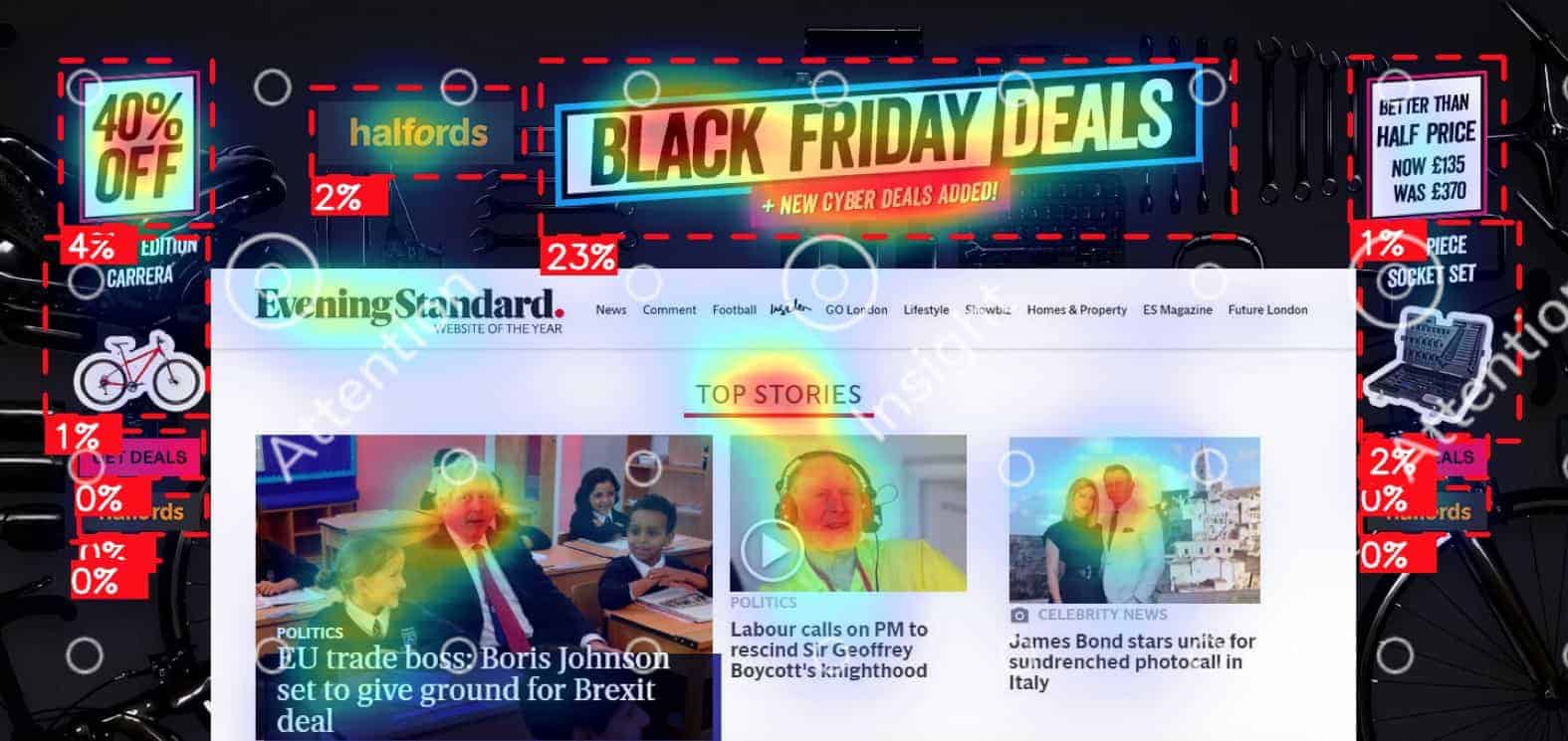
Case #2
- As in the Case #1, area at the top of the page grabs most attention. “Black Friday Deals” banner gets 23% of attention, while other objects – 0-4%.
- “40% OFF” could be improved as customers care about the prices, and numbers are more likely to lead to action. Now it gets only 4% of attention.
- We have tested other ads set of the same “Halfords” company. Interestingly, in the 1st example people barely notice the text “Better than half price. Now £135, was £370” (1%). Meanwhile, in the 2nd example, even though “ONLY £99” is in the same placement, it gets 4% of attention.
- Possibly, 2-line text in massive font is more noticeable than 4-line text.

Case #3
- “Deep English” and “Kroftman” banners get less attention (11% and 16%) than “Disney” (18%) and “Halfords” (23%) banners.
- It could be explained by the fact, that these banners are integrated into webpage, while “Disney” and “Halfords” are placed in the background of the page.
- Other possible reason – placement. “Disney” and “Halfords” banners are placed in the top middle of the page.


- Example of ”MSP 360” banner also shows that top middle position possibly attracts more attention – 19%. It is more successful than the “Deep English” and “Kroftman” banners at the middle or at the corner of the page.

To sum up, A/B testing with heatmaps can be used for different purposes. It provides insights on how your banner could be improved. Maybe CTA is invisible or all attention goes to the object that is not the key element. Also, it lets you see the big picture and evaluate how your banner looks among other information blocks on the page. Nowadays people face numerous of advertisements, so make sure your banner doesn’t go unnoticed.


